|


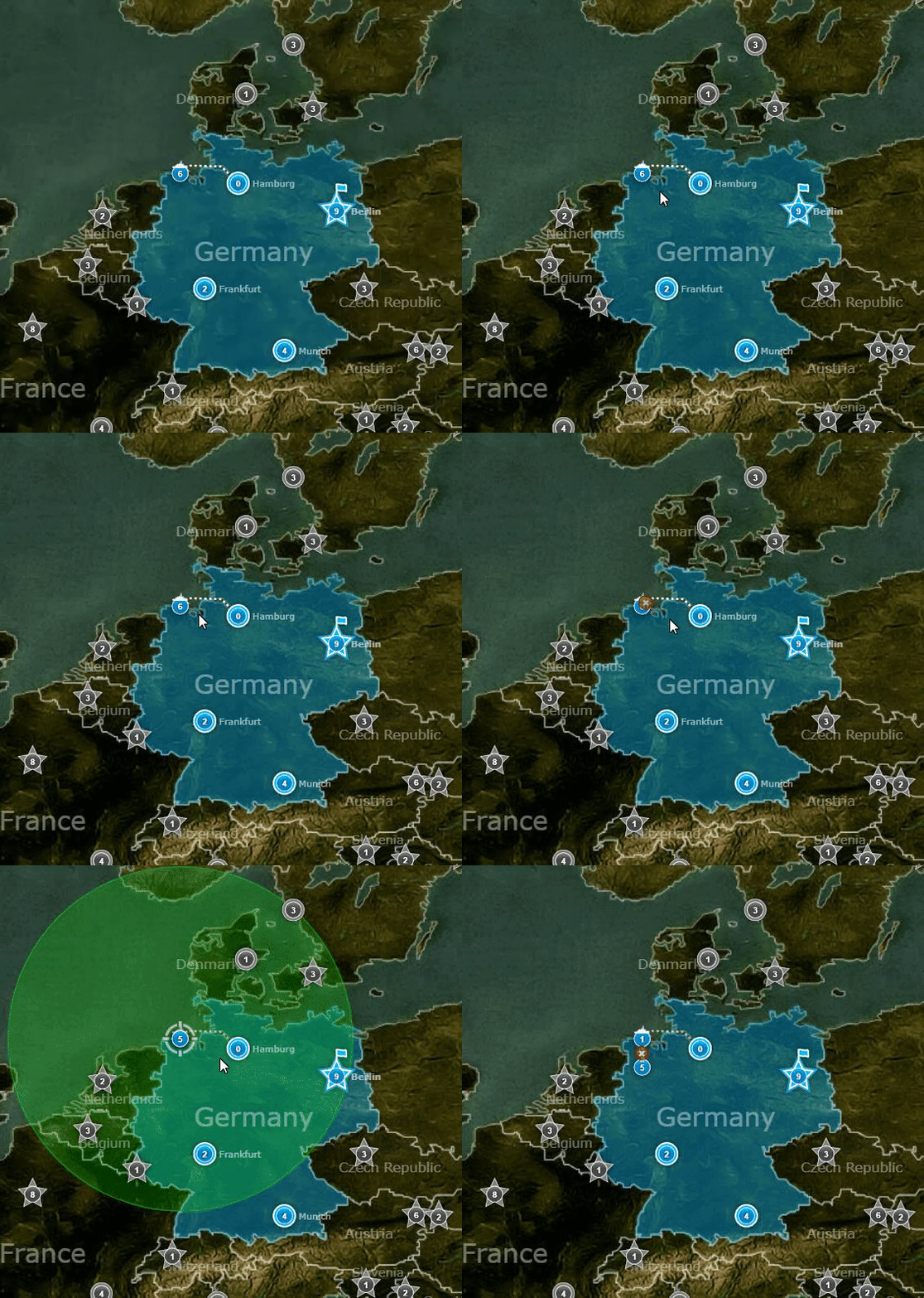
This new menu is annoying. I can't move those units out of the transport. The old one is the one below it. Someone please ask Dave to change it back. Thanks.
Ladataan...
Ladataan...
|
|
Kirjoittanut Lelouch., 10.12.2019 at 12:34


This new menu is annoying. I can't move those units out of the transport. The old one is the one below it. Someone please ask Dave to change it back. Thanks.
Yeah, I noticed that too. I believe it happens because of the new rank icons themselves; as soon as you move your mouse over them, the menu closes. It happens whether you are close to other cities / units, or alone in the middle of the field. The old icons would not close the menu.
Ladataan...
Ladataan...
|
|
I thought this was only happening to me...
Hope this can be fixed ASAP.
Ladataan...
Ladataan...
|
Deleted User 4103
Käyttäjä poistettu |
Just tested it actually, it does seem to be disappearing rather quickly. If you move your cursor fast enough it won't dissipate so easily, however.
Dave should just bring back the old quick-view menu from Silverlight IMO.
Ladataan...
Ladataan...
|
|
I'm pretty sure this has always been a thing
----
Lest we forget
Moja Bosna Ponosna
Ladataan...
Ladataan...
|
|
I just found the issue and the fix in this video!!!! https://www.youtube.com/watch?v=qJfnOdVeHxg
----
Your BOOOs mean nothing to me, I've seen what makes you cheer ..
Ladataan...
Ladataan...
|
|
I'm pretty sure this has always been a thing
It's clearly not the same thing. Look at the difference. The menu is slightly displaced to the right. If you land a transport next to an enemy city, it's almost impossible to get the units out of the trans is not docked.
Ladataan...
Ladataan...
|
|
Yes this is new. I got fucked in a highly competitive (not RP) game because I couldn't move out of transport into Norway. Great update 10/10
----
Happiness = reality - expectations
Ladataan...
Ladataan...
|
|
Was bugging me the whole day yesterday, really annoying. You still can move if you wait a bit and then quickly hover the mouse over it, but that is so unnecessary and annoying, also make it much slower while it also a way to quickly move a certain type of unit(aside from more important features).
Ladataan...
Ladataan...
|
|
It is consistently worse actually, it happens a lot more frequently than I remember.
----
Lest we forget
Moja Bosna Ponosna
Ladataan...
Ladataan...
|
|
Ah, I just made the same post maybe 2 hours before yours...
Anyways, I will repost what I hope can be done:
I know they look like minor changes (and there are), but in my games I find that with the new system, it is more difficult to hover over the city/troop and get onto the pop-up without the pop-up closing.
Could we revert the changes or make the hovering duration longer and less volatile?
----
.
Ladataan...
Ladataan...
|
|
You probably ought to use a GIF instead of a screenshot because not everyone will know what you mean.
But basically Lelouch is saying how quick the selection menu disappears when your cursor is not hovering over it like so:

Ladataan...
Ladataan...
|
Deleted User 1467045
Käyttäjä poistettu |
You probably ought to use a GIF instead of a screenshot because not everyone will know what you mean.
But basically Lelouch is saying how quick the selection menu disappears when your cursor is not hovering over it like so:

what about if i want to use inf and gen at once?
Ladataan...
Ladataan...
|
|
No, I don't remember it being a problem up to about a month or two ago. It is possible to grab one unit type from a stack but I find you need to try it a few times before it works. Having the pop-up disappear 4 or 5 times in a row is what I would describe as mildly annoying, especially if it's a large game. Kudos to EJR for the GIF. It definitely captures the problem...
----
https://atwar-game.com/user/539231/signature.png
Ladataan...
Ladataan...
|
|
Ladataan...
Ladataan...
|
|
You probably ought to use a GIF instead of a screenshot because not everyone will know what you mean.
But basically Lelouch is saying how quick the selection menu disappears when your cursor is not hovering over it like so:

This has been a problem for me for years
----
*War in Europe again isn't good for anyone... that's why the EU Needs to Evoke and Become the EEC once more, as an International, Nationalist Union Long Live The Realms! Long Live the Europeans!*
Ladataan...
Ladataan...
|
|
Verry anoying indeed, almost unplayable in big games with lil time
----
...још сте ту...
Ladataan...
Ladataan...
|
|
I've been forced to change my entire expansion repetoire as turk, there are literally only 2 expansions from my old repetoire that i can still do...
----


Ladataan...
Ladataan...
|
|
Got the same shit but it doesn't affect my gameplay lol
----

Ladataan...
Ladataan...
|
Deleted User 4103
Käyttäjä poistettu |
Kirjoittanut Froyer, 15.12.2019 at 03:40
Got the same shit but it doesn't affect my gameplay lol
Pretty much the same. Just flick to the menu until Dave fixes it.
Ladataan...
Ladataan...
|
|
It's not a bug. I moved the hover menu on purpose. It always got in the way of things I was trying to click on.
----
 | All men can see these tactics whereby I conquer,
but what none can see is the strategy out of which victory is evolved.
--Sun Tzu

|
Ladataan...
Ladataan...
|
Deleted User 4103
Käyttäjä poistettu |
Kirjoittanut Dave, 28.12.2019 at 15:01
It's not a bug. I moved the hover menu on purpose. It always got in the way of things I was trying to click on.
Could you bring back the Silverlight one then? It was less intrusive overall than the current one, I feel like it would be the best of both worlds regarding your issues with it and the competitive community's.
Ladataan...
Ladataan...
|
|
Kirjoittanut Dave, 28.12.2019 at 15:01
It's not a bug. I moved the hover menu on purpose. It always got in the way of things I was trying to click on.
True it did get in the way but now it's hard to use the function it was intended for.
Ladataan...
Ladataan...
|


